Is Funding in Your State Equitable? A Tour of Our New Data Tool
Recently, we released Funding Gaps 2015, along with an online data tool, which looks at local and state funding for high- and low-poverty school districts, as well as for districts with the most and fewest students of color. (Our analysis only focuses on state and local funding, as federal funding only makes up 10 percent of total spending on schools.) While our report focuses mainly on national and top-level state results, the data tool lets you take a closer look at funding inequities within individual states.
Below are some examples of the type of information you can find with the tool, using Pennsylvania as an example.
How do the revenues of districts at different levels of poverty compare?
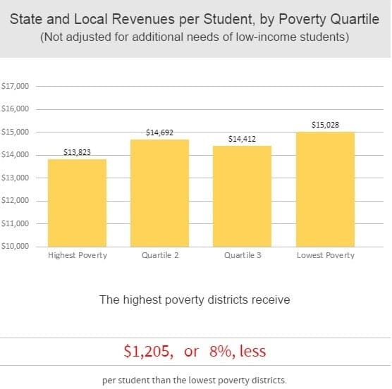
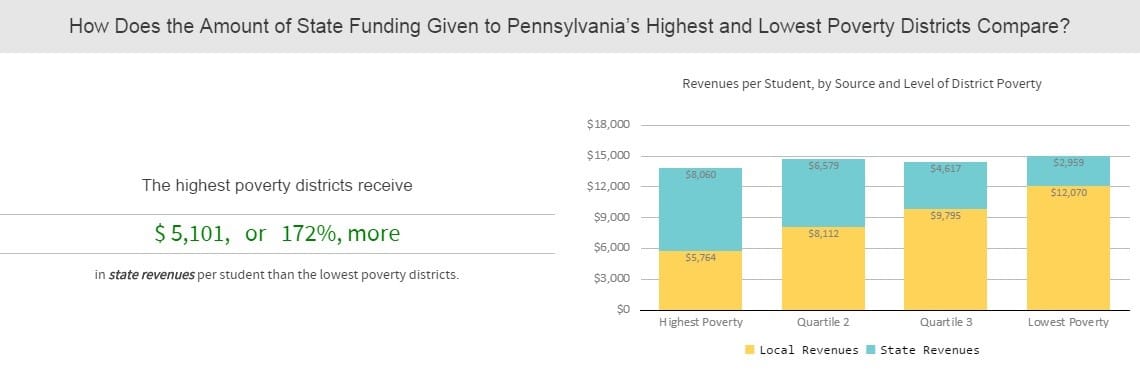
After some basic student demographic information, the first two charts you will see show the amount of state and local funding that districts at different levels of poverty in your state receive. The chart on the left in the tool (shown below) shows the average state and local revenues per student for four groups of districts, from the highest to the lowest poverty. Each of the groups includes about the same number of students.
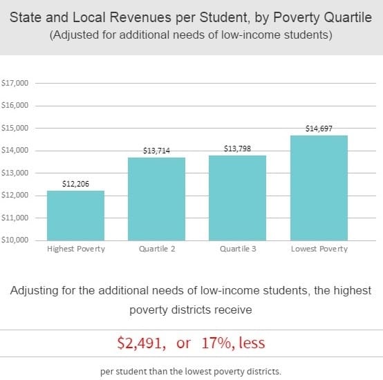
The chart does not account for the fact that low-income students may need additional supports in school, which require additional money. The chart on the right in the tool (shown below) factors in these additional needs, using the very conservative assumption that it costs 40 percent more to educate a student in poverty.
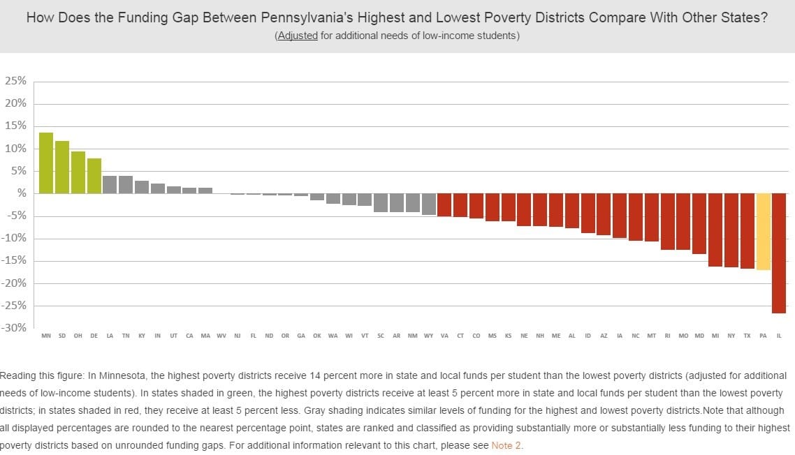
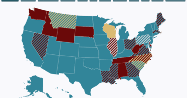
Just below these charts are two more that let you compare the funding gaps in your state (highlighted in yellow) with those in other states across the country. States that are shaded in green on these charts give at least 5 percent more state and local funding to their highest poverty districts, while states that are shaded in red give them at least 5 percent less funding. States that appear gray provide similar levels of funding for their highest and lowest poverty districts.
The first chart allows you to compare funding gaps that do not account for the additional needs of low-income students. In the example below, we see that Pennsylvania has the third-largest funding gap in the country.

You can also compare funding gaps that factor in the additional costs of educating low-income students.
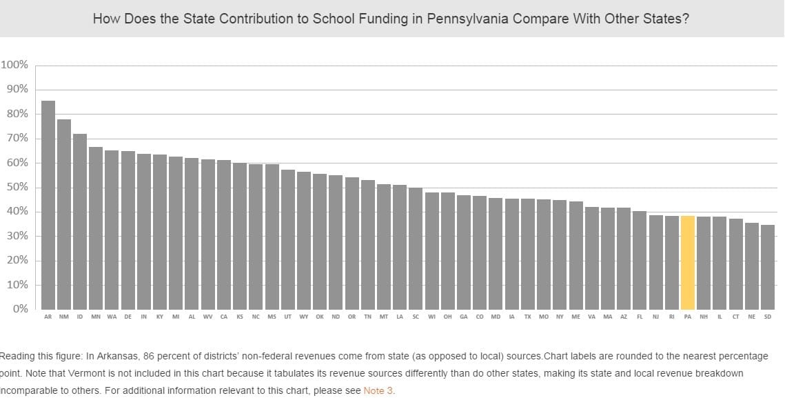
How much of district funding comes from state sources?
While local funds come mainly from property taxes, which can vary widely from district to district, state dollars can and should be used by state legislatures to counteract disparities in local funds. The next chart on the tool shows how much funding comes from state sources in each state. Here we see that with about 40 percent of district dollars coming from state (as opposed to local) sources, Pennsylvania contributes one of the smallest shares of school funds in the country.
Just below this chart is one that examines whether these state funds are offsetting local funding differences by showing the distribution of state and local dollars among districts of different poverty levels in your state. The text to the left of this chart details how much more (or less) state funding goes to the highest poverty districts than to the lowest poverty ones. Here we see that in Pennsylvania, even though the state gives $5,100 more in state funds to its highest poverty districts than its lowest poverty districts, this isn’t enough to offset the disparities in local funds.
How do the revenues of districts with different levels of enrollment of students of color compare?
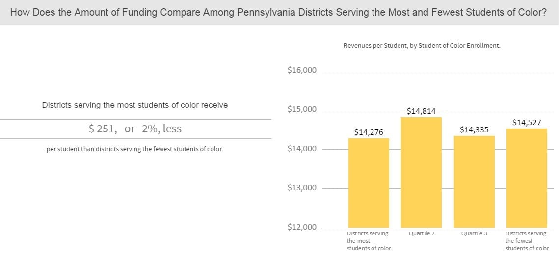
Prior studies have shown that funding gaps don’t only occur based on poverty level, and so our tool also allows you to see gaps in funding between districts serving the most students of color and those serving the fewest. The first chart in this section shows state and local revenues for groups of districts from those serving the most children of color to those serving the fewest.
The final chart lets you compare the funding gap for students of color in your state to those in other states across the country. Once again, green shading indicates that a state is providing at least 5 percent more funds to districts serving the most students of color than to those serving the fewest, while red shading indicates that it provides at least 5 percent less. Gray shading indicates similar levels of funding for districts serving the most and the fewest students of color.

We hope this tool helps you learn more about funding equity in your state.


